Shipped | Consumer UX, Design System, System Thinking, Visual Design

Overview
Problem
Earning user trust is crucial for a donation platform. However, the legacy product's poor user experience hinders it.
Solution
Defining Goals
UX Audits


Phase 1 – Identified Problem Space
Problem examples

Phase 1 – Goal
Project Roadmap
With clear goals, I created a project roadmap to align expectations and schedules with the founders and the engineering.

Design
To accommodate the tight timeline and engineering requests, the design was delivered in three parts, and the process followed the same sequence.
1. Foundation for global implementation (Colors, typography, nav bar … )
2. Common components (CTA buttons, textfields … )
3. Screen specific components and application
Foundation
I began by designing the foundational elements for further components based on three key considerations.


Components
Building on the foundation, I created both universal and screen-specific components with three key considerations.


Application e.G. 1:
Fundraiser Detials

Application e.G. 2:
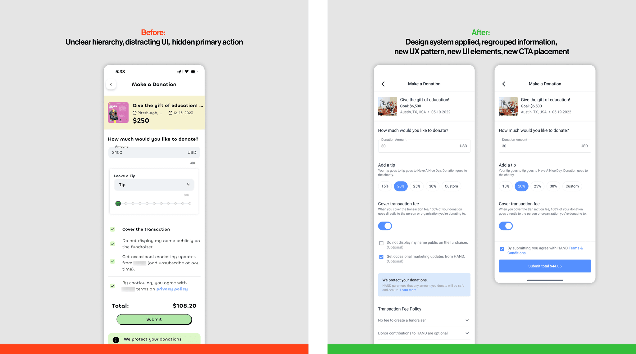
Make a Donation
Application e.G. 3:
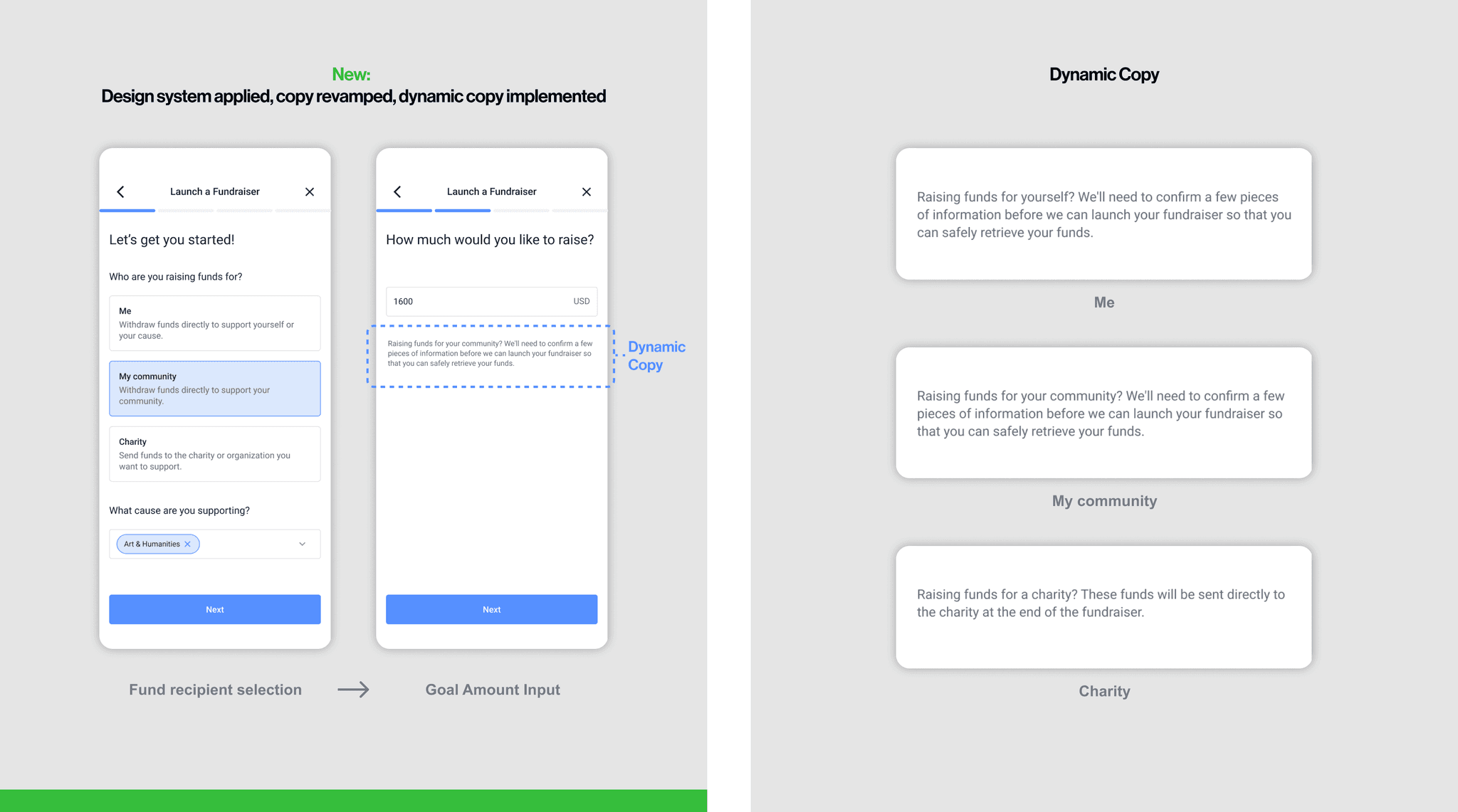
Launch a Fundraiser
IMpact
43 complex high fidelity screens delivered in 1 week
The design system streamlined the design process and optimized workflows with the engineering.

Thorough file documentation to support the expanding team
I included application examples for each component in the design library and a design file guide to support both current and future team members. Additionally, I introduced a labeling system in Figma to manage multiple versions efficiently.

Reflection
System thinking
Experiencing how a single component can shape not only one screen design but also the overall product experience, and importantly, influence the platform's credibility was a significant lesson for me.
Project management
Defining the project scope with the founders and aligning tasks and feasibility with the engineering team to successfully ship a project within set timelines gave me a good insight on product strategy.
ⓒ 2025 Junhyung Cho